Brand Identity
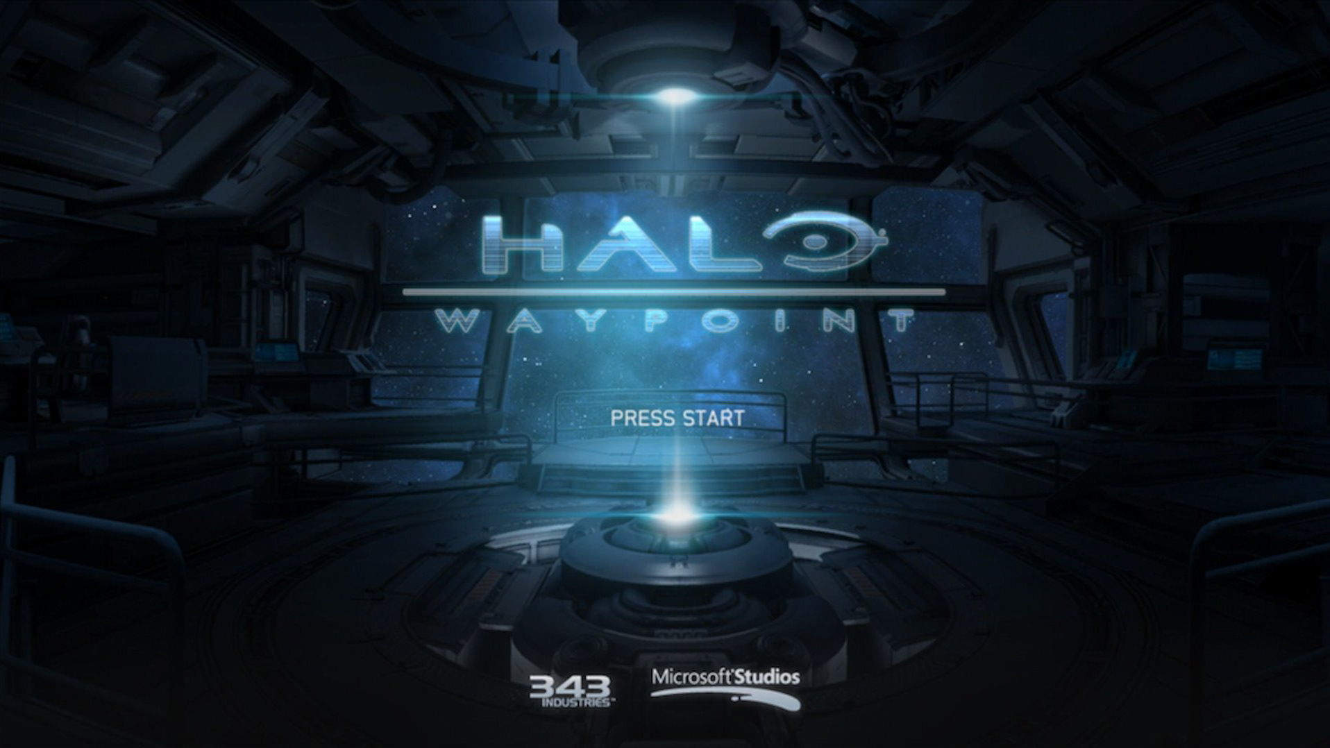
For a while, our website didn’t have a Waypoint logo but with the inclusion of a new companion app we needed new branding that would appear in app stores, on device home, and menu screens. The solution we landed on takes design cues from past logos but with an updated modern typeface and a strong logomark that can be used independently like in a favicon or app icon setting.
Role: Lead Visual Designer
Waypoint Website
One of our top visual goals, for the website, was to align with Infinite’s design direction but also have our own unique style. We wanted to incorporate larger images since ultrawide and 4K monitors are becoming the norm. This allows us to showcase the Halo universe in more detail. We wanted to incorporate strong cinematic type with contrasting thick and thin weights to create structure and order. We also wanted to minimize supplementary graphic design like we did in the past. Things like thin segmented lines and subtle transparent shapes help frame the content without distracting.
Role: Lead Visual Designer
UX Design: Tiana Los
Designed with: Eddie Arriesgado, Patrick Marko
UX Design: Tiana Los
Designed with: Eddie Arriesgado, Patrick Marko
Customization in Game, on Web, and on App
News Article View
Stats Example on Web and App
Accessible Infographics
In this redesign, we wanted to increase functionality and Accessibility. We paid close attention to colors, color contrast, textures, font sizes, and font weights. Throughout our site we are constantly checking the contrast ratio to make sure all the text is readable against all background scenarios. We also designed our charts and graphs to be less dependent on color. We started out with no colors at all and played around with line weight and texture.
Waypoint Service Awards
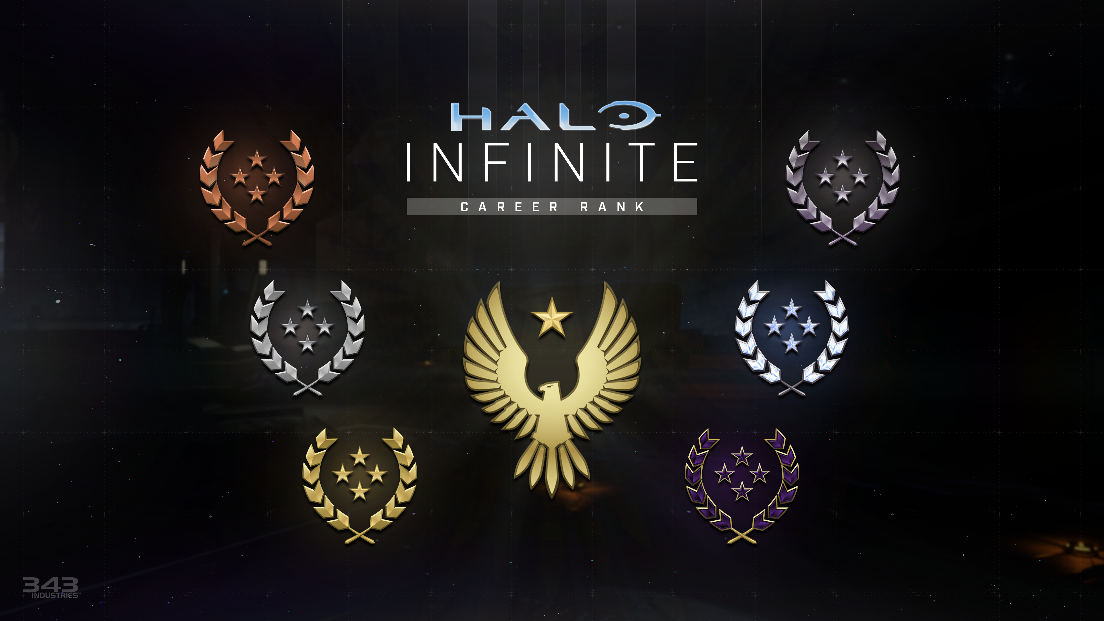
New in this version of Waypoint are a new set of service awards. I wanted to make medallions that looked very premium, prestigious, and also very unique to Waypoint. I took design cues from past commendations, medals, and achievements and combined that with my work on the Halo: Outpost Discovery medallions.
